Showing posts with label review. Show all posts
2011-06-14
Hikari No Densetsu- Tonkam
Anybody still knows Hikari? Good news for those who loved the old series: Tonkam publishes it. I already wrote about "Aishite Knight" and this is just another pretty old series some of the "older generation" of manga fans and ogling anime watches might know.
1 BD (manga) will cost 9 euro and I guess they will be as thick as Aishite Knight (which is.... very thick!). Volume one will be released at the end of this month. If you can read French and love Hikari: buy them. :D I certainly will buy the fist volume and write a review about it. Nothing better than some old-school charm.
2011-04-21
Boom & a comic you should read :)
for work.... I have no idea how long it took to make it. again it's just a detail but I love how that part turned out. Nearly done with 50% of the first work-part and the more I work on those the more excited I am.
And now the goodie part:
Some people might still know "Aishite Knight" (in Germany the anime series was streamed as "Rock'n Roll Kids"). :) I recently found the books andafter thinking about it I instantly bought those. Good old times when TV was good and didn't show series just made to sell products.
The books are quite thick which means for only 9 Euros you'll get over 300 pages including two color pages and a really fancy cover I'll write some more about later. :D Anyways, the whole series is completed in 4 books. The only (possibly) bad thing is: it's in French. I have to admit my French was never close to being perfect and I've been out of school for over.. uh... 8 years now (omg...).
It doesn't mean you have to be scared. My french was "enough" to get through the books without too many question marks over my head and though I didn't get every single word it wasn't too bad.
Honestly I think I spend more time reading those than with any other book I read. ^^;
The story is basically the same as in the anime and I was excited to see Shella and his group again and of course Guiliano. Man, how I love the cat!
The style is quite old-fashioned but alas, the series IS old. But I have to admit that the quality of the pages is much better than I expected. Though stumbling over some odd mistakes no editor would forgive nowadays it's fluently and I enjoyed the different faces a lot. Kaoru Tada had the -also nowadays very rare- gift to make every character 100%ly unique and just for that the books are worth... the French. :)
What I was suprised about was the cover. It SPARKLES. A lot. It's impossible to take a picture of it but every cover is partially coated with glittering varnish and it's oddly veryyyyy cool. One thing I love about the French publications is that the publisher tend to make those worth everything. I wish some German publishers would do that as well. I still want a sparkle cover for Kulla. Really >_<
Anyways, "Aishite Knight" is published by Tonkam and can be found easily via Amazon. I hope some hearts will flutter now. Hurry and get yours! :)
Anne
And now the goodie part:
Some people might still know "Aishite Knight" (in Germany the anime series was streamed as "Rock'n Roll Kids"). :) I recently found the books and
The books are quite thick which means for only 9 Euros you'll get over 300 pages including two color pages and a really fancy cover I'll write some more about later. :D Anyways, the whole series is completed in 4 books. The only (possibly) bad thing is: it's in French. I have to admit my French was never close to being perfect and I've been out of school for over.. uh... 8 years now (omg...).
It doesn't mean you have to be scared. My french was "enough" to get through the books without too many question marks over my head and though I didn't get every single word it wasn't too bad.
Honestly I think I spend more time reading those than with any other book I read. ^^;
The story is basically the same as in the anime and I was excited to see Shella and his group again and of course Guiliano. Man, how I love the cat!
The style is quite old-fashioned but alas, the series IS old. But I have to admit that the quality of the pages is much better than I expected. Though stumbling over some odd mistakes no editor would forgive nowadays it's fluently and I enjoyed the different faces a lot. Kaoru Tada had the -also nowadays very rare- gift to make every character 100%ly unique and just for that the books are worth... the French. :)
What I was suprised about was the cover. It SPARKLES. A lot. It's impossible to take a picture of it but every cover is partially coated with glittering varnish and it's oddly veryyyyy cool. One thing I love about the French publications is that the publisher tend to make those worth everything. I wish some German publishers would do that as well. I still want a sparkle cover for Kulla. Really >_<
Anyways, "Aishite Knight" is published by Tonkam and can be found easily via Amazon. I hope some hearts will flutter now. Hurry and get yours! :)
Anne
2011-03-24
Flip it, Babe! -Photoshop and OpenGL
The Rotation tool of Photoshop CS5 is one of the best inventions ever. I supsected CS5 wouldn't offer (to me) anything I really love but ... gods, I love rotation when I need straight(er) lines and it comes in handy if you need to ink or work neat.
don't ask what the motive is.... anyways, big file is big. I guess you'll be able to see everything....
More information by Adobe can be found here:
http://kb2.adobe.com/cps/404/kb404898.html
and here:
http://help.adobe.com/en_US/photoshop/cs/using/WSA6DF9C40-CEA8-4cfd-9A8B-44108E2975DD.html
I know Painter had it for ages but as some people might have painfully experienced Painter seems to be unable to NOT crash. I mostly work with 600 dpi and I doubt Painter would have liked my game board with 2 m width and 600 dpi.
Hope somebody didn't know the Rotation tool and loves it as much as I do now :)
don't ask what the motive is.... anyways, big file is big. I guess you'll be able to see everything....
More information by Adobe can be found here:
http://kb2.adobe.com/cps/404/kb404898.html
and here:
http://help.adobe.com/en_US/photoshop/cs/using/WSA6DF9C40-CEA8-4cfd-9A8B-44108E2975DD.html
I know Painter had it for ages but as some people might have painfully experienced Painter seems to be unable to NOT crash. I mostly work with 600 dpi and I doubt Painter would have liked my game board with 2 m width and 600 dpi.
Hope somebody didn't know the Rotation tool and loves it as much as I do now :)
2011-01-30
Wacom Intuos Grip Pen- Review
The Intuos Grip is meant for Intuos 4 but really... who cares. So I ordered 1 package (2 grips for 17 euro.. totally okay!) and puzzled the grip onto my pen. And of course it works. And damn, it's really nice.
I have to warn everybody that you won't be able to access the keys on your pen anymore. Simply impossible. But if you're okay with it the hand relaxes a lot more. Actually what I personally always wished for- and somebody seems to listen to my prayers. ;)
The grip can be purchaed via Amazon. If you're not from Germany you'll get the detailled information on the German site anyway :)
*FOLLOW THIS LINK*
Wacom Intuos4 Grip Pen - Digitalstiftgriff (Packung mit 2 ), ACK-30002
As I said: 2 grips for 13- 18 euro (depending on the shop)
My rating: Awesome. One of the best inventions I got in my hands.
2010-12-11
For Miss Kirschvogel :)
I promised Frau Kirschvogel to make some more pics of the Art S. Buck mannekins and here we go. Actually those are still tricky since some parts are not as cooperaive as they should be but it's okay since they need to be stiff. You know if a pose works when the figurines stop falling ;)
I think the female one above shows it pretty much. I wasn't sure if she keeps from tumbling but the pose is static.
The -still very- cool part is that you can take pics of different perspectives. For me it's practically the best since it's always a bit annoying to get those correct and well... here they actually are. Click, done.
This is how far the back can be bend. If you add the legs as well it's pretty much. You just have to keep an eye on the different parts (like legs or arms) to sit in the correct position. Here it's not that problematic but the male leg gives away when you bend it without ckecing since it's so buff.
Super-hero picking something up.... with pretty shadows...
and Super-Hero picking something up from a different angle. And other pretty shadows...
Sitting works as well... especially on a Bodum cup *arf*
And surfing but still not tumbling around as well. They are really damn well balanced I have to say.
So much for new pics. I still wish the female had switchable shoulders as well. It makes a lot of sense with some poses.
Anne
And since 99% of the random people hitting this blog are searching for Art S.Buck mannekins: There you go
Sphinx Kitteh... loves the heater in winter. :)
Labels:
Art S. Buck,
Hannibal and Treadle,
mannekins,
review
2010-10-10
Smudgeguard- review
As promised a review of the "SmudgeGuard2" which can be used for Graphic tablets and especially Cintiq.
I tested it for two weeks now and compared it with my Lycra sock :B
The Smudgeguard can be bought via amazon and other stores. For all German folks: Click
The SG costs around 30 Euros. Ouchn! For 30 euros I expected a better packaging design. It looks a bit cheap. But maybe I'm just too picky.... It's basically a Nylon glove with 2 fingers. SG 1 has 1 finger (Pinky one).
That's how it looks like when you have it on. Very fancy. The SG comes in 4 sixes- you find a measurement help online. Though I'm not a .. tiny person I have only M (gosh, how on earth can somebody have XL.. if I have M!). And the wrist band fits a bit sluggish- though it's the correct size. Which gives me thoughts about considering buying one size smaller since the band will loosen up a bit after a while.
My biggest problem is that the fingers are not long enough for my octofingers. I dislike it when you have the seam somewhere but not where it belongs. I would like to know how people with very short fingers find the thing since I guess it's not pleasant as well if you have too much glove for not enough finger. O_o
And ... my lycra sock. For German folks again: Schlecker! 2,99 Euro for 2 (of course... it's a sock after all). Which means 1 "glove" for 1,50. It's nice because it's with lycra which means it fits really tight and won't wobble around your arm. Plus it's long....
as you can see here. I think the worst about the SG is that it's so short. I hover over my GT with my whole arm. So the hand is basically not the problem but the arm sticking to the GT.
Very professional cut out but you can choose the height where you want to have the whole and that's one thing I love. Because even if it looks weird you can make it comfortable as you like.
I guess you can already see where I'm heading...
I think the Smudgeguard is *okay* but not for that price and it's still not "tight" enough to sit properly on your hand. I like my Lycra sock a lot more since it covers the whole arm and I don't have a mucky feeling on my fingers after a while. IF you consider socks look out for Women's with Lycra. It's washable and you can use 20 of those compared to the SG.
PS. I totally forgot: I love to wear at least one ring on my.. Ringfinger. Impossible with the Smudgeguard. Yes, i know totally unimportant but ring vers SG= I favour my ring.
and a bit news on cats. Hantje is still very tiny and a real princess. She is totally picky on food and choosing the right food for the day is more or less "What will Hantje love today.. doh." There's still no machine for translating "Mi-mi-mi" into "I want chicken" which is a bit annoying. I think (and hope.. because it's so cute) she will stay with her babyish face.
Ignore the clothes plz O_o; .... Tretel turned into a Catzilla already. He's heavy and Lew said he looks a bit mean though he's the biggest bozo on earth. And his feet grow more and more... looks like he's not finished with growing into something very big.
AND... we got the new scratching post. It's 3 meters 2something huge and ... just huge. I wanted to have something the cats can actually *really* climb on and stumbled over the company "Petfun" and what's really special: customizable posts depending on your ceiling height. 2,50 meters cost the same as 3, 50 which is really cool. The bole is no chipboard but massiv wood. this thing can't be killed by any cat.
I have no idea if they ship outside Germany but if you think that one is cool browse for "Jacky O." in the shop. I have to add that we added a wicker basket and a wall holder.
Happy End for the kittens (I know I spoil them too much.. god knows how much I spend on them already =____= ; ).
2010-10-06
Art Academy -first try
Well… where to start. I got a DSi XL yesterday and started testing the Art Academy. If you think “Oh gosh, she starts advertising like hell”… nope, I won’t, don’t worry. ;)
The last game console I had was a Sega Game Gear so you see I’m pretty much totally out of it. Or was.Good about the whole thing is that even noobs can use it since 99% are pretty intuitive.
Starting with the bad things: The only thing that is really bad is that nobody considered adding porting. If you finished something and want to show off: Impossible. And I guess nobody wants to take a pic of the screen everytime. I hope they will add that soon- since I googled it and a lot of people complained it seems to be something nobody likes.
Free drawing - for those who want to have some minutes off the lessons and those who are too curious to get a lesson *before* they tested everything. You know, artists can be kids. Of course i started painting before even looking into the rest. O.o
The second screen -your touchscreen has all small icons on top. They pop up if you activate them via arrow. It's simple but for such a small screen it's perfect. after 5 minutes it's easy and natural to switch.
The palette acts a bit unusual but it's cool since you see the color wheel on top and can decide which color you add and what color will come out. As you can see I have a light green-yellow in. Activate the basic color and tap on the others and they automatically mix. Nice. Though I miss a cyan.
The blue what's on the palette is a neutral sky-blue. As I said you don't have an "export image" option so those are pics I took this morning.
First day opinion: As a “small console game” Art Academy is pretty much fun. The graphics and especially “Bacon” are nice and make it more appealing than I’d guess.
The last game console I had was a Sega Game Gear so you see I’m pretty much totally out of it. Or was.Good about the whole thing is that even noobs can use it since 99% are pretty intuitive.
Starting with the bad things: The only thing that is really bad is that nobody considered adding porting. If you finished something and want to show off: Impossible. And I guess nobody wants to take a pic of the screen everytime. I hope they will add that soon- since I googled it and a lot of people complained it seems to be something nobody likes.
Free drawing - for those who want to have some minutes off the lessons and those who are too curious to get a lesson *before* they tested everything. You know, artists can be kids. Of course i started painting before even looking into the rest. O.o
The second screen -your touchscreen has all small icons on top. They pop up if you activate them via arrow. It's simple but for such a small screen it's perfect. after 5 minutes it's easy and natural to switch.
The palette acts a bit unusual but it's cool since you see the color wheel on top and can decide which color you add and what color will come out. As you can see I have a light green-yellow in. Activate the basic color and tap on the others and they automatically mix. Nice. Though I miss a cyan.
The blue what's on the palette is a neutral sky-blue. As I said you don't have an "export image" option so those are pics I took this morning.
First day opinion: As a “small console game” Art Academy is pretty much fun. The graphics and especially “Bacon” are nice and make it more appealing than I’d guess.
2010-08-18
If you shop half awake....
... you normally fail. I bought paper for my recent project and was half-aslepp I guess. Otherwise I can't explain why I bought rough Lanaquarelle paper whereas I wanted to buy Grain Satine. ARGGG!
Anyways, I guess I'll go shopping tomorrow again- spending even more money on ridiculous expensive paper BUT at least I know why I like Grain Satine more.
Lemme show :)
big image is big o_O
This is rough Lanaquarelle.... I think for normal watercolour illustrations it's totally fine. What I personally dislike about the paper is that pigments keep getting stuck in the surface texture.
For some people this might be "uhh.... artsy", for me it's "uh... crap!"
When I need to do details (a lot) it's like war on the paper. And if you work on 61 centimeters it's WWIII. Arf!
What you see is a mix of Gouache and Lukas watercolour.
In reality the colors look a bit dull. I'll keep telling myself it's the paper.
And now... Grand Satine. Gosh.. I love it.
To say it with a Despicable Me quote: "IT'S SO FLUFFY!" ;)
After the base dried you're able to add a lot of details.
Just let me say that you have to be very patient and let it dry 100%ly or else you might get nasty blotches.
But I love the surface and how fine you can work on it.when dry it looks wonderful.
I just have to find out how to get the clouds done but I guess I'll find out soon enough while working. You can't really copy the techniques you use while working with acrylics.
But hurray for white gouache.
While I write the two test sheets are finally dry and I can't stop stressing out that the rough paper looks totally odd. Very very very odd.
Arf again for failing in shopping.
Anyways, I guess I'll go shopping tomorrow again- spending even more money on ridiculous expensive paper BUT at least I know why I like Grain Satine more.
Lemme show :)
big image is big o_O
This is rough Lanaquarelle.... I think for normal watercolour illustrations it's totally fine. What I personally dislike about the paper is that pigments keep getting stuck in the surface texture.
For some people this might be "uhh.... artsy", for me it's "uh... crap!"
When I need to do details (a lot) it's like war on the paper. And if you work on 61 centimeters it's WWIII. Arf!
What you see is a mix of Gouache and Lukas watercolour.
In reality the colors look a bit dull. I'll keep telling myself it's the paper.
And now... Grand Satine. Gosh.. I love it.
To say it with a Despicable Me quote: "IT'S SO FLUFFY!" ;)
After the base dried you're able to add a lot of details.
Just let me say that you have to be very patient and let it dry 100%ly or else you might get nasty blotches.
But I love the surface and how fine you can work on it.when dry it looks wonderful.
I just have to find out how to get the clouds done but I guess I'll find out soon enough while working. You can't really copy the techniques you use while working with acrylics.
But hurray for white gouache.
While I write the two test sheets are finally dry and I can't stop stressing out that the rough paper looks totally odd. Very very very odd.
Arf again for failing in shopping.
2009-05-21
Intuos... a matter of principles
weeee! My Intuous 3 arrived some days ago. It´s the same I have at work and I really love it. I just hope my second monitor arrives next week. I´m so used to work with two that it doesn´t make sense not to buy one (and since I´m going to work a lot more digital this year it´s useful).

(I should have cleaned up before taking the pic.. um...)
As you can see scrollbars are on both sides. I deactivated the left ones since I´m a left-handed person and scrolling with your amr while painting is really uncool. I use the right ones and honestly... I could go without those. Normally I work with pen +keyboard. And that´s enough.
Since my old graphire at home is okay but not that... let´s call it "perfect" as the Intuos which I have been using for 4 years now, I decided to buy a bigger one. The options where: Intuos A4 Number 3 OR 4.
When I saw the Intuos 4 I thought: "WTF?!"
Call me picky but have a look at this:
left side: The logo is on the bottom... When I said:
"I can´t use it, i´m left-handed o_o" the only answer was:
"But you can flip it, it works this way as well."
I´m not a graphic diva but for me it´s not acceptable that a left-handed person has to accept an upside down logo just because somebody decided that I´m part of a minority.
Yes, I CAN put it upside down. Of course it will work. Yes, it´s just a matter of principle.
Is it just me who thinks it´s odd?
I hope the design will be change when my new GT is broken... in some years. If the other GTs weren´t that bad I would decide to use another company´s product. I bought a classic pen as additional tool and the price was just ridiculous. 80 bucks for a pen made in China. Production price.. um.. maybe 20 Cent. The GT costs around 200 atm. See the point? It´s a bloody PEN, for 80 BUCKS! Rahh...
Only good thing I can tell you: My graphire pen plastic wrap started to crumble and harden last year. I wrote an email, attached a photo, explained the problem and got a new one. For free. Well, the service rocks. I never thought they would do it but wonders happen.

(I should have cleaned up before taking the pic.. um...)
As you can see scrollbars are on both sides. I deactivated the left ones since I´m a left-handed person and scrolling with your amr while painting is really uncool. I use the right ones and honestly... I could go without those. Normally I work with pen +keyboard. And that´s enough.
Since my old graphire at home is okay but not that... let´s call it "perfect" as the Intuos which I have been using for 4 years now, I decided to buy a bigger one. The options where: Intuos A4 Number 3 OR 4.
When I saw the Intuos 4 I thought: "WTF?!"
Call me picky but have a look at this:
left side: The logo is on the bottom... When I said:
"I can´t use it, i´m left-handed o_o" the only answer was:
"But you can flip it, it works this way as well."
I´m not a graphic diva but for me it´s not acceptable that a left-handed person has to accept an upside down logo just because somebody decided that I´m part of a minority.
Yes, I CAN put it upside down. Of course it will work. Yes, it´s just a matter of principle.
Is it just me who thinks it´s odd?
I hope the design will be change when my new GT is broken... in some years. If the other GTs weren´t that bad I would decide to use another company´s product. I bought a classic pen as additional tool and the price was just ridiculous. 80 bucks for a pen made in China. Production price.. um.. maybe 20 Cent. The GT costs around 200 atm. See the point? It´s a bloody PEN, for 80 BUCKS! Rahh...
Only good thing I can tell you: My graphire pen plastic wrap started to crumble and harden last year. I wrote an email, attached a photo, explained the problem and got a new one. For free. Well, the service rocks. I never thought they would do it but wonders happen.
2009-05-09
Paper Dreams

Paper Dreams... one of the books I waited for. Yesterday it arrived and again, since I ordered it in the UK, it had to go through the customs and was delivered in a shed paperboard package and a totally beautiful blue customs duty sack. >_>;
Ok, back to the book. It´s huge (bigger than A4, can´t squeeze it in any of my bags) and heavy (realized that yesterday while carrying it home). And it´s totally awesome and worth every Cent.

it´s 09:14 in the morning here and I just ran over the pages stopping here and there. Even if you´re not into Disney all the storyboards and concepts and color settings and interviews might be enough to love the book. It´s so interesting and as most people who suggested the book told me: "You won´t be able to learn nothing."

Alice. Totally different from everything you´ve seen on the screen and I guess that´s the most interesting part (and always the best part of the "The Art Of..." books btw): How did the characters look in the concept phase.
If I had time I would rummage through the book all day. But I have an appointment with a photographer (new author portrait... and geee, I am not the "the cam loves me-type" XD) and I still have to finish some illustrations. Crap.
Final thought: If you are into animation, Disney, concepts or just interested in spending a lot of money for a huge book: Buy it.
I just googled and saw that it´s much more cheaper on Amazon.com (listed price: 60.00, now 37.80) than Amazon.de atm. Not that I hate spending too much money on books, just a good point for those who order via .com ... here it´s already listed for 60-120 euro, so grab it while it is cheap.
2009-01-17
books
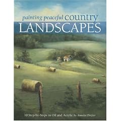
I bought two books last week. Those are:

&

I had a look into both yesterday and I think those are for semi-advanced painters.
I favour the first one since Annette Dozier included some pages which explain the materials not only via text but also with photos which i think is very important. Especially if you have no idea where and how to hold the different brushes.
Both books have step-by-step explanations with text and photos but in the end I think it´s a lot of guessing and trying out yourself. I thought about using some techniques on my own, had a look on my own illustrations and decided to try it when I am done with my recent proejct (Kulla 3). It might be frustrating to try new techniques in the middle of a project. For both me and my publisher.
pro:
-good explanation of brushes
-good explanation of colors (for those who have a problem mixing and wanna stick to given colors in the first place)
-good explanation of light/shadows
-excellent explanation of grayscale-technique (never found that in a book before....)
contra:
-not for total beginners
-if you want to learn techniques you bettter attend a course, the books are as additional material helpful afterwards
-the books can´t solve general problems and they won´t talk to you when you´re stuck
I think I will keep them although they disturb me a bit with the "general techniques". I work totally different (and that´s not via accident but I learned it that way) and I felt a bit bad about it afterwards. Like.... "Am I doing it wrong all time?!" XD
oh my...
&
I had a look into both yesterday and I think those are for semi-advanced painters.
I favour the first one since Annette Dozier included some pages which explain the materials not only via text but also with photos which i think is very important. Especially if you have no idea where and how to hold the different brushes.
Both books have step-by-step explanations with text and photos but in the end I think it´s a lot of guessing and trying out yourself. I thought about using some techniques on my own, had a look on my own illustrations and decided to try it when I am done with my recent proejct (Kulla 3). It might be frustrating to try new techniques in the middle of a project. For both me and my publisher.
pro:
-good explanation of brushes
-good explanation of colors (for those who have a problem mixing and wanna stick to given colors in the first place)
-good explanation of light/shadows
-excellent explanation of grayscale-technique (never found that in a book before....)
contra:
-not for total beginners
-if you want to learn techniques you bettter attend a course, the books are as additional material helpful afterwards
-the books can´t solve general problems and they won´t talk to you when you´re stuck
I think I will keep them although they disturb me a bit with the "general techniques". I work totally different (and that´s not via accident but I learned it that way) and I felt a bit bad about it afterwards. Like.... "Am I doing it wrong all time?!" XD
oh my...
Subscribe to:
Posts (Atom)